Logo Color Psychology: How the Right Colors Shape Brand Perception
By Logo Outlets
64 Views
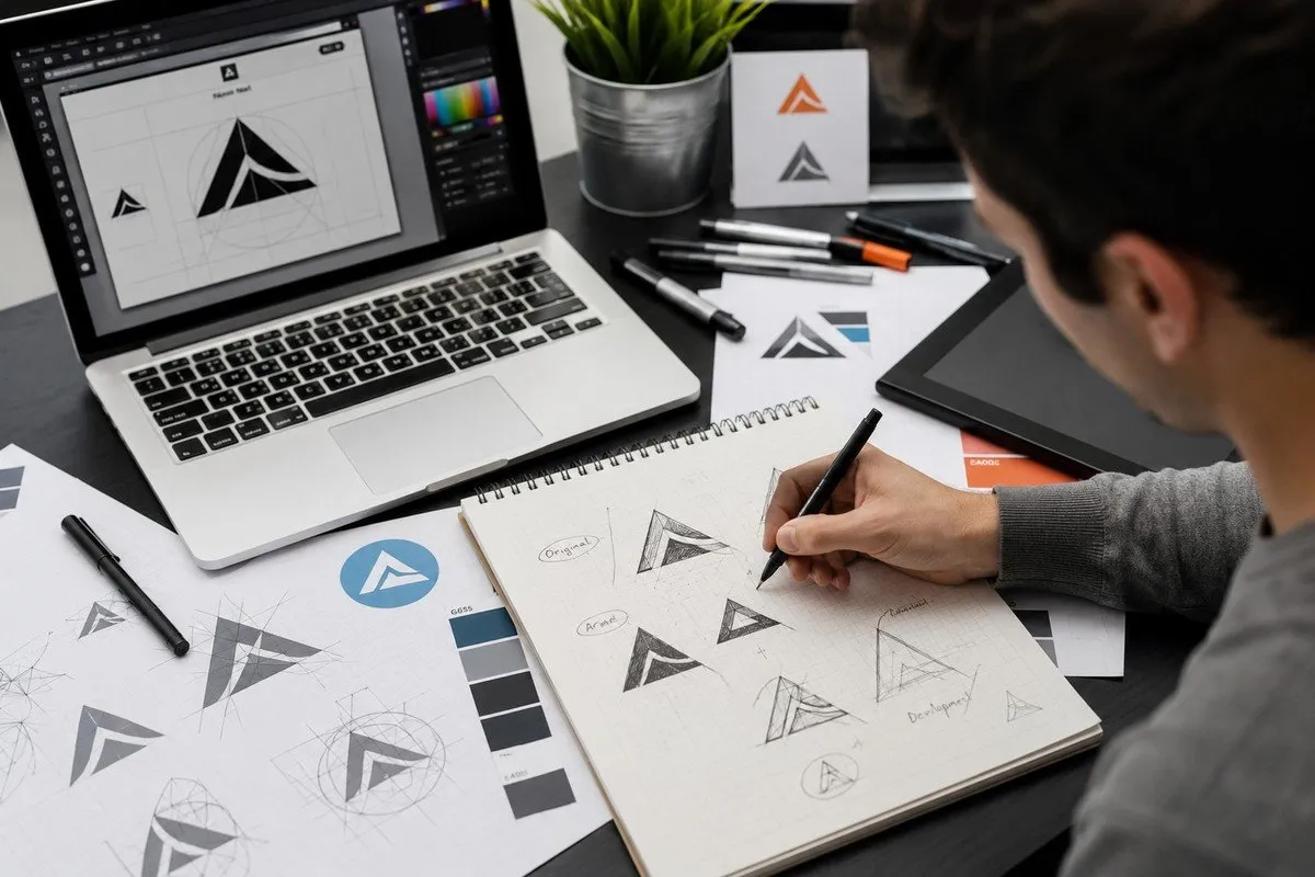
A logo can communicate a surprising amount of information before a customer reads a single word about your business. Its shape, typography, spacing, and color all contribute to the impression people form when they first encounter a brand.
Among these elements, color can be particularly powerful.
Different colors can create different emotional associations, influence how a business is perceived, and help a company establish a recognizable visual identity. However, choosing colors for a logo isn't simply about selecting the shades you personally like.
Understanding logo color psychology can help businesses make more thoughtful branding decisions. The right palette should reflect the personality of the company, connect with its target audience, work within its industry, and remain practical across different marketing channels.
Why Color Matters in Branding
Imagine seeing two identical logos with completely different color schemes.
One uses deep blue, while the other uses bright orange.
Even though the shapes and typography are identical, the two brands may create very different impressions.
That's because color contributes to visual communication.
A carefully selected palette can make a business appear professional, energetic, luxurious, friendly, trustworthy, or creative.
However, color should never be treated as a universal formula. Cultural differences, industry expectations, personal experiences, and context can all influence how people respond to particular colors.
The goal is to use color strategically rather than relying on assumptions.
Blue: Trust and Stability
Blue is one of the most common colors used in corporate branding.
It is frequently associated with qualities such as trust, stability, professionalism, and reliability.
That's one reason blue appears frequently in industries such as finance, technology, healthcare, consulting, and professional services.
But because blue is so common, businesses need to think carefully about differentiation.
Using blue doesn't automatically make a company trustworthy. The shade, typography, symbol, and overall design still need to work together.
A distinctive blue-based identity can be effective, but simply copying the color choices of competitors may make a brand less memorable.
Red: Energy and Attention
Red is visually powerful and can create a sense of energy, confidence, urgency, or excitement.
Businesses that want a bold and energetic personality may consider red as part of their identity.
It can work particularly well for brands that want to attract attention quickly.
However, using too much intense color can overwhelm a design.
The goal isn't necessarily to make the logo as noticeable as possible. It's to create the right type of attention.
A carefully selected shade of red can become a strong accent, while a more restrained application may create a sophisticated appearance.
Green: Growth and Natural Associations
Green is commonly connected with nature, health, growth, freshness, and sustainability.
Businesses operating in environmental, wellness, agriculture, food, and related industries may find green particularly relevant.
However, green isn't limited to those categories.
Technology companies, financial businesses, and other organizations can also use green when it supports their desired personality.
The exact shade makes a difference too.
A dark green can communicate something very different from a bright, energetic green.
Yellow: Optimism and Friendliness
Yellow can create a bright, positive, and energetic impression.
It can be particularly useful for brands that want to appear approachable, cheerful, or youthful.
However, yellow can become difficult to read when used against certain backgrounds.
This makes contrast especially important.
If yellow is part of your logo, test it across light and dark backgrounds before finalizing the identity.
A visually attractive color is only useful when customers can actually see and understand the logo.
Orange: Creativity and Energy
Orange combines some of the energy associated with red with the friendliness often associated with yellow.
It can create a warm, creative, enthusiastic, and approachable impression.
For brands that want to avoid appearing overly formal, orange can provide a more energetic visual direction.
Again, context matters.
A muted orange may feel sophisticated, while a bright orange can appear playful and energetic.
The supporting typography and graphic elements should complement the chosen shade.
Purple: Creativity and Premium Appeal
Purple has historically been associated with creativity, imagination, luxury, and sophistication.
It can help a brand establish a distinctive personality, particularly when used thoughtfully.
However, purple can become visually overwhelming if the shade is too intense or combined with too many competing colors.
A carefully balanced purple palette can create a memorable identity without making the logo feel excessive.
Black: Simplicity and Sophistication
Black is one of the most versatile choices available to designers.
It can create a sophisticated, modern, powerful, or minimalist appearance.
One advantage of black is its flexibility. It can work across many industries and can pair effectively with almost any accent color.
Black also makes it easier to create monochrome versions of a logo for documents, printing, and other applications.
For businesses seeking a timeless identity, black can be a strong foundation.
White: Space and Simplicity
White is often overlooked because it may not appear as an obvious "logo color."
Yet white space plays an important role in visual identity.
A white logo can create a clean, minimal, modern appearance when placed against a darker background.
More importantly, empty space around a logo allows its visual elements to breathe.
A crowded design can become difficult to understand, while thoughtful spacing can make even a simple logo feel polished.
Don't Choose Colors in Isolation
One of the most important aspects of logo color psychology is understanding that colors rarely operate alone.
A color's effect can change depending on what surrounds it.
For example, a bright color paired with black can feel bold and energetic, while the same color combined with white may feel cleaner and lighter.
Typography also changes how a color is perceived.
A sophisticated serif typeface can make a color feel more traditional, while a geometric sans-serif can create a modern impression.
This means your final palette should always be evaluated as part of the complete logo rather than as individual color samples.
Consider Your Industry—but Don't Follow It Blindly
Industry expectations can provide useful guidance.
A financial company may want to communicate reliability. A creative agency may want to appear imaginative. A restaurant might focus on appetite, warmth, or hospitality.
But following every industry convention can create another problem: sameness.
If all competitors use identical colors, your business may have difficulty standing out.
Research your industry to understand customer expectations, then look for opportunities to create differentiation without making the brand feel disconnected from its market.
Think About Your Target Audience
Your preferred colors aren't necessarily the colors your customers will respond to most effectively.
Consider who you're trying to reach.
Age, culture, industry, expectations, and context can all influence how people perceive visual identities.
A children's brand may benefit from a brighter palette, while a premium professional service may prefer something more restrained.
This doesn't mean there is a single color that every member of an audience will prefer.
Instead, your palette should support the overall impression you want your business to create.
Make Your Palette Practical
A logo doesn't exist only on a designer's screen.
It will eventually appear on websites, social media, packaging, business cards, advertisements, signage, merchandise, and other materials.
Your colors need to work across these applications.
Consider whether the logo remains recognizable:
- On a white background
- On a dark background
- In black and white
- At a small size
- In digital formats
- In printed materials
Professional custom logo design services can help businesses consider these practical requirements while developing their visual identity.
Avoid Using Too Many Colors
More colors don't automatically create a stronger brand.
A logo with too many competing shades can become difficult to recognize and difficult to reproduce consistently.
A focused palette is usually easier to manage.
You might have one primary color, one or two supporting colors, and neutral shades for different applications.
The exact combination depends on the brand.
The important thing is maintaining a visual system that customers can recognize across different touchpoints.
Professional Design Can Help
Choosing a color palette may appear simple, but effective branding involves many interconnected decisions.
Professional custom logo design services can help businesses evaluate color alongside typography, composition, symbolism, scalability, and audience expectations.
Instead of choosing a color first and building everything around it, a professional process can consider the entire identity.
This can be especially valuable for companies that plan to use their logo for years rather than treating it as a temporary graphic.
Create Consistency Across Your Brand
Once you've selected your logo colors, consistency becomes essential.
Use the same primary colors across your website, social media graphics, packaging, advertisements, and other branded materials whenever appropriate.
Consistent visual presentation helps customers connect different interactions with the same business.
Over time, your colors can become part of your brand recognition.
This is why changing your palette repeatedly can create unnecessary confusion.
Work With a Design Partner
Choosing the right designer can make the branding process much easier.
Look at portfolios and evaluate whether the designer understands different industries and audiences.
Ask how they approach color selection and whether they provide different logo versions for practical applications.
For businesses looking for professional branding support, Logo Outlets provides logo design solutions for companies seeking distinctive visual identities.
A thoughtful design process can help turn a basic business concept into a cohesive identity that works across multiple platforms.
Logo Outlets can also be considered when businesses want professional guidance while developing their logo and broader visual presentation.
Final Thoughts
Understanding logo color psychology doesn't mean following a rigid list that says every business must use a particular color.
Instead, it means recognizing that color contributes to the overall message your brand communicates.
Consider your business personality, target audience, competitors, industry, and long-term goals before choosing a palette.
Test your colors across different backgrounds and applications, and make sure the final identity remains recognizable without relying on one specific environment.
If you're considering professional custom logo design services, look for a process that evaluates color as part of the complete brand rather than treating it as an isolated design decision.
Logo Outlets can be considered by businesses seeking professional support for developing a distinctive and practical visual identity.
Ultimately, logo color psychology is most useful when it helps you make intentional choices.
The right colors won't build your entire brand on their own, but when combined with strong typography, a clear concept, and consistent application, they can help create an identity customers recognize and remember.