Kraft Soap Packaging Boxes With Custom Printing Options
By bala hatun
12 Views
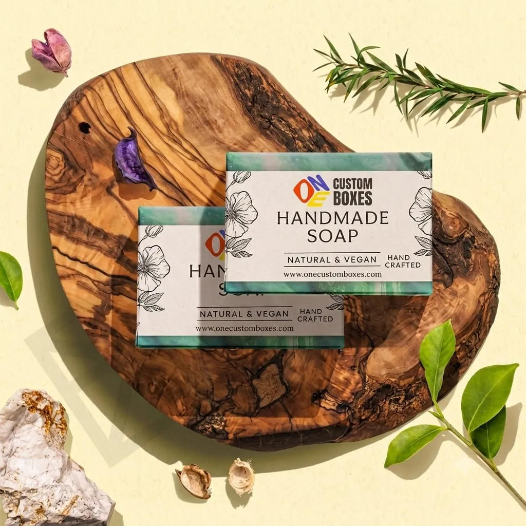
Printing on kraft is a different job from printing on white board, and soap makers often find that out at proof stage. The brown surface changes how every ink looks, the fibers soak up detail, and a design that was crisp on screen can arrive muddy. Knowing what kraft does to print, and which options suit it, saves a reprint.
How kraft changes the ink
Kraft board is brown and uncoated, so inks sit on a colored, slightly absorbent surface instead of a bright white one. Three consequences follow:
-
Light inks lose strength. Pale colors and white behave differently on brown. Standard CMYK has no white, so a pastel design turns out darker and duller than the proof suggests.
-
Dark inks hold well. Black, deep green, navy, and burgundy read cleanly and look deliberate.
-
Fine detail softens. Thin lines and tiny type spread slightly into the fibers.
None of this is a flaw. It just means the design should work with the material instead of fighting it.
Printing methods compared
Each method suits a different order size and look. Costs vary by supplier and job, so treat these as general comparisons.
|
Method |
Best for |
Strengths |
Limits |
|
Flexographic or offset (1 to 2 spot colors) |
Medium to large runs |
Low unit cost, clean solid color |
Setup cost makes tiny runs expensive |
|
Digital printing |
Short runs, testing designs |
No plates, easy variants |
Unit cost higher at volume; limited white |
|
Hot foil stamping |
Logos, small accents |
Strong contrast, premium look |
Can adhere unevenly on rough kraft |
|
Blind deboss or emboss |
Logos, borders |
No ink, no extra material |
Needs enough board thickness |
|
Rubber stamp or label |
Very small batches |
Cheap, hand-made feel |
Inconsistent, hard to scale |
For most small soap brands, one or two spot colors printed on kraft is the sensible starting point. It costs little and looks intentional.
Sizing: start from the bar
Bars vary, especially handmade ones, which can shrink slightly while curing. The sizes below are starting points, not standards.
|
Bar |
Approx. interior (W x D x H) |
Clearance guide |
|
Standard bar (about 4 oz) |
2.6 x 1.2 x 3.8 inches |
0.1 to 0.15 inches |
|
Large bar (about 5 to 6 oz) |
3.1 x 1.3 x 4.1 inches |
0.1 to 0.2 inches |
|
Guest or travel bar (about 1.5 oz) |
2.1 x 0.8 x 2.6 inches |
0.05 to 0.1 inches |
Measure your actual cured bar before ordering. Cut bars by hand vary more, so allow a little extra.
Sleeve or full box
A sleeve is a band that wraps the middle of the bar. It costs less and lets the soap show, which suits bars with swirls, embeds, or natural color. A full box protects better in shipping and gives more space for ingredients and a brand story. Choose by what the bar looks like and how it sells. A decorative bar can sell itself through a sleeve, while a product that leans on ingredient transparency benefits from the printable area of a full box.
Designs that print well on kraft
A few practical rules:
-
Use bold, simple type. Delicate scripts lose their thin strokes on absorbent board.
-
Limit to one or two colors. A single dark ink looks sharper and costs less than full-color art.
-
Avoid large solid-color blocks of light ink. Coverage can look patchy on textured stock.
-
Keep small text above a legible size. Ingredient lists need room, so confirm your market’s requirements.
-
Test the exact stock. Different kraft grades print differently, so approve the proof on the real board.
Foil, emboss, and finishing
Foil can look striking on kraft, but the rough surface sometimes causes uneven transfer. If you want contrast, ask for a foil test on the actual board first. A blind deboss presses the logo into the board without ink and tends to behave more consistently on this material. It reads as refined, and it adds no extra material, which fits a natural brand.
Oily bars can leave spots on uncoated board over time. A light interior coating or a barrier liner addresses this without changing how the outside looks. Mention it to your supplier if your recipe is on the oilier side.
Labelling and sourcing claims
Soap is regulated differently across markets, and what must appear on the pack varies. Ingredient lists, net weight, and manufacturer details are common, but confirm the requirements where you sell. Reserve space for this text before the artwork begins.
If you describe the box as recycled, FSC-certified, or recyclable, make sure you can back the claim with documentation from your supplier. Vague wording like “eco-friendly” without evidence weakens trust.
Choosing a printer
A supplier experienced with small-batch soap packaging understands tight clearances and lower minimums. When you request quotes for custom kraft soap boxes, ask about board grade, recycled content, ink type, minimum order quantity, and whether foil and deboss tests are available. Request a physical sample with your own design before committing.
A manufacturer such as One Custom Boxes can supply samples across print methods so you can compare how the same artwork behaves on kraft before choosing. Whichever supplier you pick, approve a printed sample in writing.
Mistakes to avoid
-
Designing in light colors that vanish on brown stock
-
Approving from a screen proof instead of a printed one
-
Skipping the measurement of the cured bar
-
Using thin fonts at small sizes
-
Stacking foil, emboss, and extra inks on one small box
-
Ignoring oil spotting on uncoated board
The practical takeaway
Kraft rewards simple, confident printing. Choose dark inks, bold type, and one or two colors, consider a blind deboss for contrast, and size the box from the real cured bar. Check any foil on the actual board, plan for regulatory text and oil resistance early, and approve a physical sample before ordering volume. Done that way, the material does half the branding work for you.