Basketball Jersey Design Mistakes Most Teams Make in 2026 | HAMCO Sports
By Hamco Sports
65 Views
Most coaches and team coordinators learn basketball jersey design the hard way. The first order goes wrong somehow. Numbers that looked great on the digital mockup turned out unreadable from the bleachers. Colors that seemed bold ended up too busy on real fabric. Logo placement that worked on screen suddenly looked awkward on actual players in motion. By the time the gear arrives, every flaw becomes permanent. The good news is that all of these mistakes are completely avoidable. A few minutes of awareness before approving the design saves teams from issues that can otherwise haunt the program for an entire season. The fix is knowing what to watch for in advance.
Hamco Sports has worked with thousands of basketball programs across every level of the sport. Their design team has seen which basketball jersey design mistakes show up over and over again. This guide breaks down the most common pitfalls and explains exactly how smart programs avoid them. The investment in this knowledge is small. The improvement in your final jersey quality is significant.
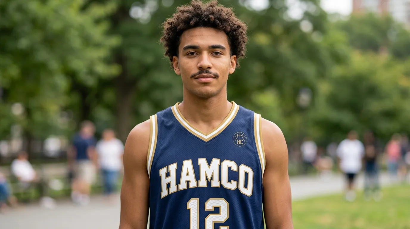
Mistake One: Poor Number Readability From the Bleachers
This is the single most common basketball jersey design mistake. Numbers that look fine on a digital mockup often disappear at game distance. Three forces cause this failure.
The first is low contrast. White numbers on a light gray base. Yellow numbers on a tan base. Black numbers on a dark navy base. These combinations look acceptable up close but vanish under bright gym lighting at typical viewing distance.
The second is overly thin number strokes. Stylized fonts with thin strokes look modern but become unreadable at distance. Block fonts with bold strokes always perform better for actual gameplay.
The third is decorative outlines that wash out. Numbers with gradients, multiple outline layers, or busy shadow effects often blur together when seen from the bleachers.
The fix is simple. Pick bold block style numbers. Use strong contrast between the number and the base. Test the design by viewing the mockup from across the room before approving it.
Mistake Two: Logo Placement That Looks Awkward in Motion
A logo that looks centered on a flat mockup can look completely off when the player is in motion. The reason is that real bodies have curves, and basketball jerseys move with the player.
A logo placed too low on the chest can disappear when the player wears compression underneath. A logo placed too far to one side can look unbalanced when the player is mid jump. A logo placed near a seam can become distorted as the fabric stretches.
The fix is to consider the jersey on real bodies in real motion. Quality suppliers use experienced design teams who have seen thousands of jerseys in actual gameplay. They guide buyers toward placements that look great both on the rack and on the court.
Mistake Three: Choosing Trendy Designs That Age Poorly
Trendy designs feel exciting in the moment. Then they look dated within a few seasons. Programs that build their visual identity around current trends often regret it when the trend shifts.
The fix is balancing modern construction with classic visual language. Strong wordmarks. Clean color blocking. Bold contrasting numbers. These elements have looked great for decades and will continue looking great for decades to come. Save the experimental design choices for special edition pieces or alternate kits rather than primary game day uniforms.
Mistake Four: Ignoring Color Reproduction Realities
Digital mockups rarely match real fabric exactly. Screens display colors using light, while fabric displays colors through dye. The same hex code can look slightly different on screen versus on actual jerseys.
Programs that approve designs based purely on mockups sometimes find that the final colors look slightly off. The fix is to ask the supplier for fabric samples in your selected colors before approving the final design. This extra step adds a few days but eliminates color related disappointment.
Mistake Five: Overlooking Sponsor Logo Compatibility
Many programs feature sponsor logos on their jerseys. The mistake comes when sponsor logos do not visually fit with the rest of the design. The result is a jersey that looks fragmented rather than unified.
The fix is treating sponsor logos as part of the overall design language rather than afterthoughts. The supplier should help integrate sponsor placement so the logos look intentional rather than tacked on.
How Hamcospo Helps Programs Avoid These Mistakes
Hamcospo design team is specifically trained to catch and prevent these common issues before they reach production. Free digital mockups arrive within twelve hours. Unlimited revisions are included at no cost. The design team flags potential readability, placement, and color issues during the revision process so buyers can fix them before approval.
Every uniform piece uses lightweight performance polyester with moisture wicking properties. Every design is fully sublimated, which means colors and graphics stay sharp through full seasons of use. There are no minimum orders on most products. Pricing is flat with no per color or per element upcharges.
Coaches and program leaders can browse the full basketball jersey design collection to start a project with the design team. The catalog covers reversible game jerseys, performance shorts, shooting shirts, quarter zip warmups, hoodies, and travel gear in youth through adult sizing.
For programs that want to coordinate the full team look beyond just jerseys, the broader custom basketball uniforms range covers home and away sets along with accessories like socks, compression sleeves, and duffle bags.
Three Final Tips to Get the Design Right the First Time
Three additional habits make basketball jersey design projects much smoother.
The first is sleeping on the design before approving it. A fresh look the next morning often catches issues that a tired evening review misses.
The second is getting a second opinion. Show the mockup to someone outside the design conversation. A fresh set of eyes catches problems familiarity hides.
The third is testing the design at game distance. Print the mockup at full size or view it from across a room. Many readability problems become obvious only when seen from realistic viewing distances.
Why This Matters for Your Program
Basketball remains one of the most popular team sports in the United States. According to the National Federation of State High School Associations, basketball consistently ranks among the most played varsity sports for both boys and girls. Data from USA Basketball shows the sport continuing to grow at every level. Every game is a branding moment, and small design mistakes accumulate across hundreds of photos, videos, and broadcast clips over a single season.
A thoughtful basketball jersey design avoids the common mistakes other programs quietly make. The investment in awareness is small. The compounding visual quality across multiple seasons is significant. For coaches and program leaders ready to build identity that ages well, taking design seriously is one of the smartest decisions you can make.